Retail Sales Forecasting with Ensemble Methods
Sales Data Analysis and Forecasting Using Ensemble Methods
Sales forecasting is a critical business function that helps organizations make informed decisions about inventory management, resource allocation, and strategic planning. Accurate sales predictions can lead to:
- Optimized inventory levels and reduced carrying costs
- Better cash flow management
- Improved customer satisfaction through product availability
- More effective marketing and promotional strategies
- Data-driven business planning and goal setting
In this guide, we’ll explore how to build a robust sales forecasting system using ensemble methods, specifically Random Forest and XGBoost. We’ll work with the Rossmann Store Sales dataset, which contains historical sales data from over 1,000 stores. The dataset presents real-world challenges including:
- Missing values and inconsistent data
- Multiple categorical and numerical features
- Temporal dependencies and seasonality
- Store-specific characteristics and promotions
We’ll cover the entire machine learning pipeline from data preprocessing to model evaluation, with a focus on:
- Data cleaning and feature engineering
- Exploratory data analysis and visualization
- Building and comparing ensemble models
- Model evaluation and interpretation
The techniques demonstrated here can be applied to various time series forecasting problems beyond retail sales.
Dataset Overview
The data is available on Kaggle: Rossmann Store Sales Competition
The data contains sales information for 1115 Rossmann drug stores.
These are some of the features in the dataset:
- Id - an Id that represents a (Store, Date) duple within the test set
- Store - a unique Id for each store
- Sales - the turnover for any given day (this is what you are predicting)
- Customers - the number of customers on a given day
- Open - an indicator for whether the store was open: 0 = closed, 1 = open
- StateHoliday - indicates a state holiday. Normally all stores, with few exceptions, are closed on state holidays. Note that all schools are closed on public holidays and weekends. a = public holiday, b = Easter holiday, c = Christmas, 0 = None
- SchoolHoliday - indicates if the (Store, Date) was affected by the closure of public schools
- StoreType - differentiates between 4 different store models: a, b, c, d
- Assortment - describes an assortment level: a = basic, b = extra, c = extended
- CompetitionDistance - distance in meters to the nearest competitor store
- CompetitionOpenSince[Month/Year] - gives the approximate year and month of the time the nearest competitor was opened
- Promo - indicates whether a store is running a promo on that day
- Promo2 - Promo2 is a continuing and consecutive promotion for some stores: 0 = store is not participating, 1 = store is participating
- Promo2Since[Year/Week] - describes the year and calendar week when the store started participating in Promo2
- PromoInterval - describes the consecutive intervals Promo2 is started, naming the months the promotion is started anew. E.g. “Feb,May,Aug,Nov” means each round starts in February, May, August, November of any given year for that store
Let’s begin by exploring and preparing our data for analysis.
Data Collection and Setup
First, we’ll import the necessary libraries and configure our environment. We’re using:
- pandas & numpy: For data manipulation and numerical operations
- matplotlib & seaborn: For data visualization
- sklearn: For machine learning models and evaluation metrics
- tensorflow: For potential deep learning extensions
- warnings: To suppress unnecessary warning messages
# Import necessary libraries
import pandas as pd
import numpy as np
import matplotlib.pyplot as plt
import seaborn as sns
import datetime as dt
import tensorflow as tf
from tensorflow import keras
from sklearn.ensemble import RandomForestRegressor
from sklearn.model_selection import train_test_split
from sklearn.metrics import mean_squared_error, mean_absolute_error, r2_score
import os
import zipfile
import warnings
warnings.filterwarnings('ignore')

# Set style and color palette
sns.set(style='darkgrid', palette='mako')
# Change the setting and put it in a dictionary
plot_settings = {
  'font.family': 'calibri',
  'axes.titlesize': 18,
  'axes.labelsize': 14,
  'figure.dpi': 140,
  'axes.titlepad': 15,
  'axes.labelpad': 15,
  'figure.titlesize': 24,
  'figure.titleweight': 'bold',
}
# Use the dictionary variable to update the settings using matplotlib
plt.rcParams.update(plot_settings)
Next, we’ll download the dataset using the Kaggle API and read the data. The dataset consists of several CSV files:
train.csv: Historical sales data for trainingstore.csv: Additional information about each storetest.csv: Data for prediction
# Download the data from kaggle
#! kaggle competitions download -c rossmann-store-sales
'''# Unzip the data
with zipfile.ZipFile('rossmann-store-sales.zip', 'r') as zip_ref:
  zip_ref.extractall('rossmann-store-sales')
# Delete the zip file
os.remove('rossmann-store-sales.zip')'''
# Read the data
train = pd.read_csv('rossmann-store-sales/train.csv')
store = pd.read_csv('rossmann-store-sales/store.csv')
test = pd.read_csv('rossmann-store-sales/test.csv')
# Inspect the data
train.info()
# Check the head of the data
train.head()
Understanding the Data Structure
Let’s examine the StateHoliday column, which uses categorical encoding:
- 0: Regular day
- a: Public holiday
- b: Easter holiday
- c: Christmas
# Check the value counts of StateHoliday
train.StateHoliday.value_counts()
We notice that the StateHoliday column uses mixed data types (both numeric and string values for 0). Let’s standardize this by converting all values to numeric:
# Convert the StateHoliday column to int64
train['StateHoliday'] = train['StateHoliday'].replace(['a', 'b', 'c'], [1, 2, 3]).astype('int64')
# Check the value counts again
train.StateHoliday.value_counts()

# Convert the Date column to datetime
train['Date'] = pd.to_datetime(train['Date'])
# Inspect the data
train.info()
# Check the head of the data
train.head()
This standardization is important because:
- Consistent data types improve model performance
- Integer encoding is more memory efficient than string encoding
- Many machine learning algorithms require numeric inputs
Let’s examine the distribution of values across all columns to identify any potential data quality issues:
# Check the value counts of each column to check for inconsistencies
for col in train.columns:
  print('Column: ', col, '
', train[col].value_counts(), '
')
Exploratory Data Analysis
Let’s start by examining the summary statistics of our data to understand the distribution of our numerical variables:
# Display the summary statistics of the data
train.describe().T.style.format('{:.2f}')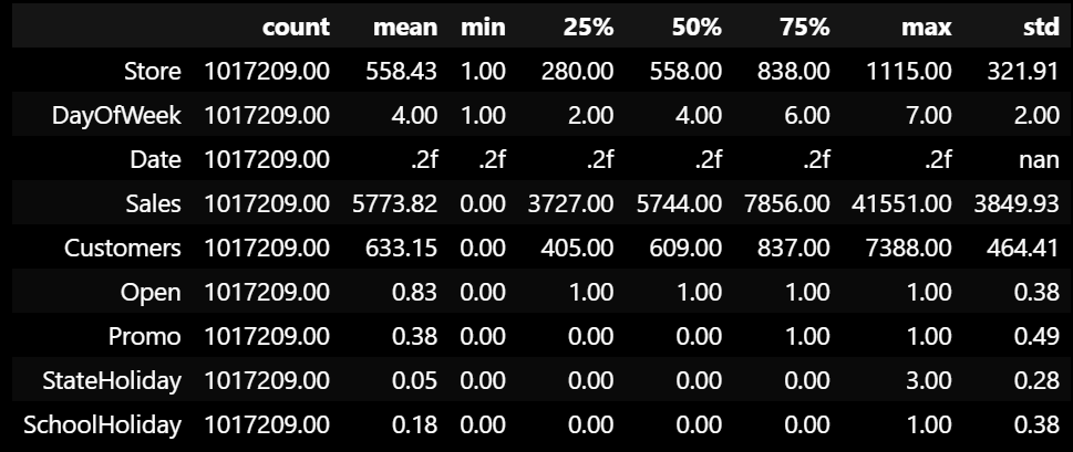
Feature Engineering
To enrich our dataset, we’ll extract temporal features from the date column and create a sales per customer metric:
# Extract the year, month, week, and day from the date column
train['Year'] = train['Date'].dt.year
train['Month'] = train['Date'].dt.month
# Isocalendar returns a tuple of (year, week, weekday) for each date
train['Week'] = train['Date'].apply(lambda x: x.isocalendar()[1])
train['Day'] = train['Date'].dt.day
# Add a new feature for sales per customer
train['SalesPerCustomer'] = train['Sales'] / train['Customers']
# Display the summary statistics of the SalesPerCustomer column
train['SalesPerCustomer'].describe()
count 844340.000000
mean 9.493619
std 2.197494
min 0.000000
25% 7.895563
50% 9.250000
75% 10.899729
max 64.957854
The sales per customer metric reveals interesting insights:
- Average spend is 9.49 euros per customer per day
- Maximum spend is 64.9 euros
- Standard deviation is 2.19 euros
- Missing values indicate days with no customers
Distribution Analysis
To better understand our data distributions, we’ll use Empirical Cumulative Distribution Functions (ECDF). ECDFs are powerful visualization tools that show:
- The complete distribution of the data
- The probability of a value being less than or equal to any given point
- Any potential outliers or anomalies
# Perform Empirical Cumulative Distribution Function (ECDF) analysis on the data
plt.figure(figsize=(12, 16))
plt.subplot(3, 1, 1)
sns.ecdfplot(data=train, x='Sales')
plt.title('Sales')
plt.subplot(3, 1, 2)
sns.ecdfplot(data=train, x='Customers')
plt.title('Customers')
plt.subplot(3, 1, 3)
sns.ecdfplot(data=train, x='SalesPerCustomer')
plt.title('SalesPerCustomer')
plt.tight_layout()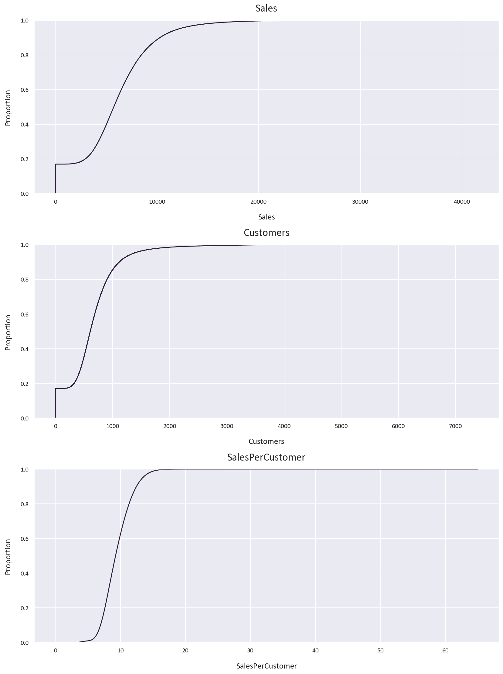
Key observations from the ECDFs:
- Sales distribution is right-skewed with 90% of sales below 10,000 euros
- Customer count is also right-skewed with 80% of days having fewer than 1,000 customers
- Sales per customer follows a more normal distribution with 60% below 10 euros
We can also see that under 20% of the data has 0 sales or 0 customers, let’s explore this further. Is it because the store is closed or is it because there are no customers? Let’s investigate this:
# Check for missing values in the data
train.isnull().sum()

# Check for days that the stores were closed
train[train['Open'] == 0].shape
# Check for days that the stores were open and had no customers
train[(train['Open'] == 1) & (train['Customers'] == 0)].shape
# Add the two conditions together to get the total number
# of days that the stores were closed or had no customers
train[(train['Open'] == 0) | ((train['Open'] == 1) & (train['Customers'] == 0))].shape
(172817, 14)
(52, 14)
(172869, 14)
The missing values in SalesPerCustomer come from:
- Days when stores were closed (172817)
- Days with zero customers despite being open (52)
For our analysis, we’ll remove these rows as they could introduce bias into our models:
# Drop the rows where the stores were closed or had no customers
train = train[(train['Open'] == 1) & (train['Customers'] != 0)]
# Check for missing values again
train.isnull().sum()
# Check the shape of the data
train.shape
Store 0
DayOfWeek 0
Date 0
Sales 0
Customers 0
Open 0
Promo 0
StateHoliday 0
SchoolHoliday 0
Year 0
Month 0
Week 0
Day 0
SalesPerCustomer 0
(844340, 14)
Let’s visualize the distributions again after cleaning:
# Perform ECDF analysis on the data again
plt.figure(figsize=(12, 16))
plt.subplot(3, 1, 1)
sns.ecdfplot(data=train, x='Sales')
plt.title('Sales')
plt.subplot(3, 1, 2)
sns.ecdfplot(data=train, x='Customers')
plt.title('Customers')
plt.subplot(3, 1, 3)
sns.ecdfplot(data=train, x='SalesPerCustomer')
plt.title('SalesPerCustomer')
plt.tight_layout()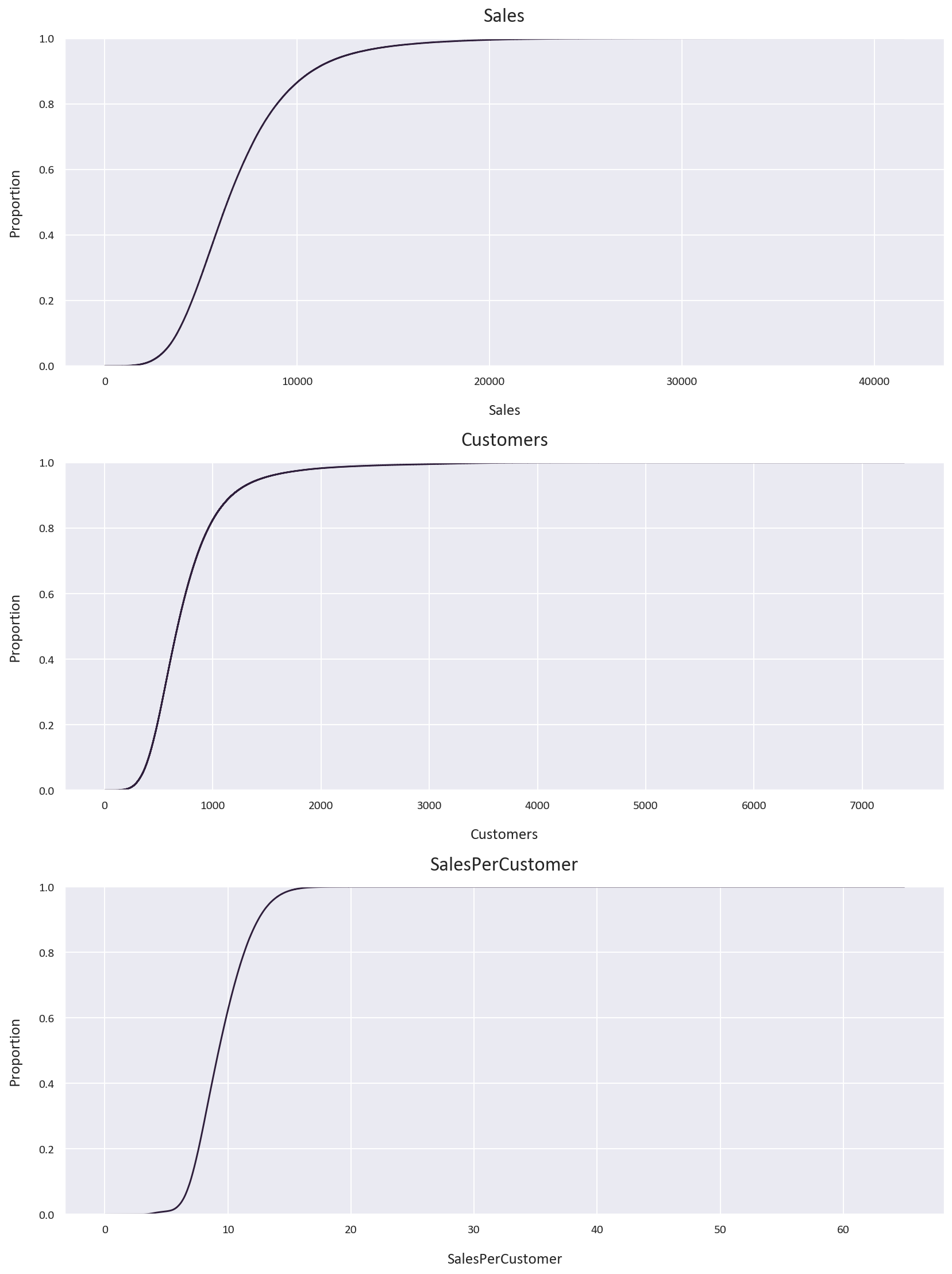
Since the ‘Open’ column now contains only 1 value, we can drop it:
# Drop the open column
train.drop('Open', axis=1, inplace=True)
Correlation Analysis
Understanding feature relationships is crucial for model selection and feature engineering:
# Visualize the correlation matrix of the data
plt.figure(figsize=(12, 8))
sns.heatmap(train.corr(), annot=True, cmap='mako', fmt='.2f')
plt.title('Correlation Matrix')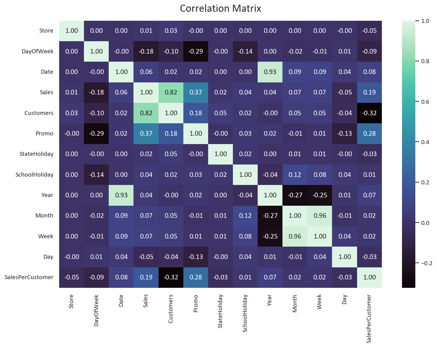
Key insights from the correlation matrix:
- Year shows weak correlations - expected due to limited time range (2013-2015), it should be dropped.
- Later months and weeks show higher sales and customer counts - potential seasonal effects
- Day of month has negative correlation with sales and customers - possible salary cycle effect
- DayOfWeek shows negative correlation - unexpected pattern worth investigating
While these temporal features show modest correlations, they may still provide valuable signals for our predictive model.
# Drop the year column
train.drop('Year', axis=1, inplace=True)# How many days of the week are the stores open?
train['DayOfWeek'].value_counts()
# Which stores are open on Sundays?
train[train['DayOfWeek'] == 7]['Store'].unique()
# What percentage of the stores are open on Sundays?
len(train[train['DayOfWeek'] == 7]['Store'].unique()) / len(train['Store'].unique()) * 100DayOfWeek
6 144052
2 143956
3 141922
5 138633
1 137557
4 134627
7 3593
array([ 85, 122, 209, 259, 262, 274, 299, 310, 335, 353, 423,
433, 453, 494, 512, 524, 530, 562, 578, 676, 682, 732,
733, 769, 863, 867, 931, 948, 1045, 1081, 1097, 1099, 877],
dtype=int64)
2.9596412556053813
As we suspected, only 2.95% of the stores are open on Sundays. This explains the negative correlation between the DayOfWeek column and the sales and customers columns.
This can introduce bias to our model, so we can drop the DayOfWeek column.
# Drop the DayOfWeek column
train.drop('DayOfWeek', axis=1, inplace=True)
Store Data Analysis
Now let’s explore the store data.
The store dataset contains important metadata about each store location. Let’s examine its structure:
# Check the head of the data
store.head()
# Inspect the store data
store.info()
# Column Non-Null Count Dtype
--- ------ -------------- -----
0 Store 1115 non-null int64
1 StoreType 1115 non-null object
2 Assortment 1115 non-null object
3 CompetitionDistance 1112 non-null float64
4 CompetitionOpenSinceMonth 761 non-null float64
5 CompetitionOpenSinceYear 761 non-null float64
6 Promo2 1115 non-null int64
7 Promo2SinceWeek 571 non-null float64
8 Promo2SinceYear 571 non-null float64
9 PromoInterval 571 non-null object
The store data includes several important features:
- Store: Unique identifier for each store
- StoreType: Categories a, b, c, d representing different store types
- Assortment: Product Assortment levels (a = basic, b = extra, c = extended)
- CompetitionDistance: Distance in meters to nearest competitor store
- CompetitionOpenSince(Month/Year): When the nearest competitor opened
- Promo2: Promo2 is a continuing promotion for some stores: 0 = store is not participating, 1 = store is participating
- Promo2Since(Year/Week): The year and calendar week when the store started participating in Promo2
- PromoInterval: The consecutive intervals Promo2 is started, naming the months the promotion is started anew. E.g. “Feb,May,Aug,Nov” means each round starts in February, May, August, November of any given year for that store
Let’s handle missing values in the store dataset:
# Check for missing values in the data
store.isnull().sum()

# Check the missing values in the CompetitionDistance column
store[store['CompetitionDistance'].isnull()]
# Fill the missing values with the mean since the data is continuous
store['CompetitionDistance'].fillna(store['CompetitionDistance'].mean(), inplace=True)

# Check the missing values in the CompetitionOpenSinceMonth column
store[store['CompetitionOpenSinceMonth'].isnull()]

# Fill the missing values with 0
store['CompetitionOpenSinceMonth'].fillna(0, inplace=True)
store['CompetitionOpenSinceYear'].fillna(0, inplace=True)

# Check the missing values in the Promo2SinceWeek column
promo_missing = store[store['Promo2SinceWeek'].isnull()]
Store 0
StoreType 0
Assortment 0
CompetitionDistance 3
CompetitionOpenSinceMonth 354
CompetitionOpenSinceYear 354
Promo2 0
Promo2SinceWeek 544
Promo2SinceYear 544
PromoInterval 544
Our missing value strategy varies by feature type:
-
Competition Distance (Continuous Variable)
- Fill with mean value
- Preserves distribution characteristics
- Maintains statistical relationships
-
Competition Open Since (Temporal Variable)
- Fill with 0 to indicate no competition
- Logical placeholder for missing temporal data
- Maintains data consistency
-
Promo2SinceWeek, Promo2SinceYear, and PromoInterval (Categorical Variable)
- Fill with 0 for non-participating stores
- Consistent with business logic
- Preserves promotional patterns
Let’s verify our assumption about Promo2 missing values:
# Are there any stores that have Promo2 as 1 but the Promo2SinceWeek is null?
promo_missing[promo_missing['Promo2'] == 1].shape

# Fill the remaining missing values with 0
store.fillna(0, inplace=True)
# Make sure there are no missing values in the data
store.isnull().sum()
(0, 10)
As we assumed, the missing values in the Promo2SinceWeek, Promo2SinceYear, and PromoInterval columns are because the stores are not participating in Promo2. We can simply fill these values with 0 as the information is not available.
Time-based Analysis
For effective time series analysis, we need to:
- Set the date as our index for time-based operations and sort the index from oldest to newest, which will make plotting the data easier.
- Convert categorical variables to numeric format
- Calculate competition duration features
# Merge the train and store data on the Store column
df = pd.merge(train, store, on='Store')

# Set the Date column as the index
df.set_index('Date', inplace=True)
# Sort the index in ascending order
df.sort_index(inplace=True)

# Convert categorical variables to numeric
df['StoreType'] = df['StoreType'].replace(['a', 'b', 'c', 'd'], [1, 2, 3, 4])
df['Assortment'] = df['Assortment'].replace(['a', 'b', 'c'], [1, 2, 3])

# Calculate competition duration
df['CompetitionOpenMonths'] = 12 * (df.index.year - df['CompetitionOpenSinceYear']) +                            (df['Month'] - df['CompetitionOpenSinceMonth'])
The competition duration calculation requires careful handling of edge cases:
# Check for stores with no competition data
zero_comp = df[df['CompetitionOpenSinceMonth'] == 0]
print(f"Stores with no competition data: {len(zero_comp)}")

# Verify if missing month and year data align
month_year_match = (df[df['CompetitionOpenSinceMonth'] == 0].index ==                  df[df['CompetitionOpenSinceYear'] == 0].index).all()
print(f"Missing month and year data match: {month_year_match}")

# Set competition months to 0 for stores with no competition
df.loc[df['CompetitionOpenSinceMonth'] == 0, 'CompetitionOpenMonths'] = 0

# Check for outliers in competition duration
outliers = df[df['CompetitionOpenMonths'] > 1200]
print(f"Stores with competition duration > 100 years: {len(outliers)}")

# Fix incorrect historical data (store 815 showing competition since 1900)
df.loc[df['Store'] == 815, 'CompetitionOpenMonths'] = 0
After cleaning the competition data, we found:
- 268,602 rows have 0 values in the CompetitionOpenSinceMonth and CompetitionOpenSinceYear columns, which causes CompetitionOpenMonths to have huge values. As this is a huge portion of the data, we should set the CompetitionOpenMonths to 0 for these stores.
- One store had an incorrect competition date (year 1900), we also set the CompetitionOpenMonths to 0 for this store.
- Remaining durations are within reasonable ranges
Let’s analyze the relationship between competition and sales:
# Plot correlation matrix focusing on competition metrics
competition_cols = ['Sales', 'Customers', 'CompetitionDistance',
                 'CompetitionOpenMonths', 'Promo', 'Promo2']
plt.figure(figsize=(10, 8))
sns.heatmap(df[competition_cols].corr(), annot=True, cmap='mako', fmt='.2f')
plt.title('Competition Impact Correlation Matrix')
plt.tight_layout()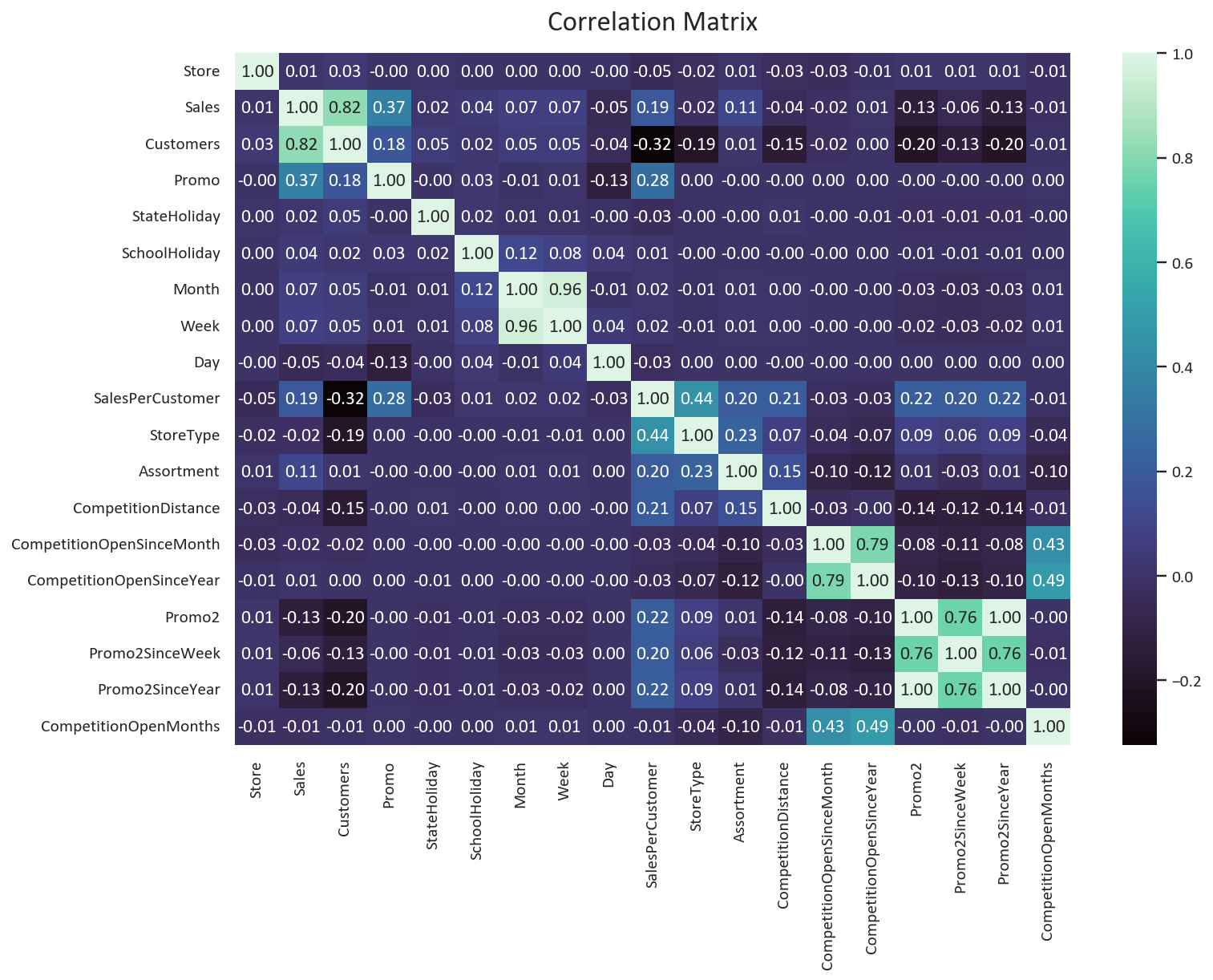
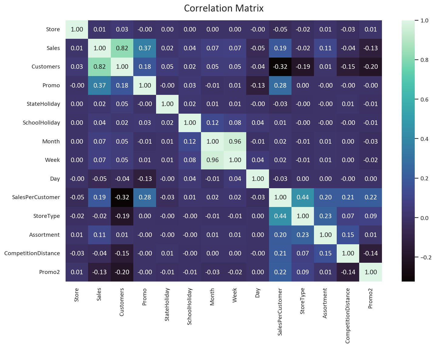
Key findings about competition:
- Competition distance has a negative correlation with customers (-0.15) and sales (-0.04).
- Competition duration shows minimal impact on sales (+-0.02). We can safely drop the CompetitionOpenSinceMonth, CompetitionOpenSinceYear, and CompetitionOpenMonths columns.
- The Promo feature have strong positive correlation (Sales: 0.37, Customers: 0.18) but the correlation for the Promo2 feature is also negative (Sales: -0.13, Customers: -0.20).
Based on these insights, we can simplify our feature set:
# Remove low-impact competition features
df.drop(['CompetitionOpenSinceMonth', 'CompetitionOpenSinceYear',
       'CompetitionOpenMonths', 'Promo2SinceWeek',
       'Promo2SinceYear', 'PromoInterval'], axis=1, inplace=True)

# Verify remaining features
print("Final feature set:")
for col in df.columns:
  print(f"- {col}")
The negative correlation between competition distance and sales suggests that:
- Stores in high-density areas have more competition but also more customers
- Competition might be a proxy for location desirability
- Urban locations tend to have both higher sales and more competition
This counterintuitive relationship highlights why we should keep the competition distance feature despite dropping other competition-related columns.
The negative correlation between Promo2 and Sales/Customers suggests that:
- Stores that are participating in consecutive promotions have lower sales/customers.
- The scarcity aspect of promotions might be more important than the duration.
The final feature set is:
- Store
- Sales
- Customers
- Promo
- Promo2
- CompetitionDistance
- StateHoliday
- SchoolHoliday
- Month
- Week
- Day
- SalesPerCustomer
- StoreType
- Assortment
Data Analysis & Data Visualization
# Check the skewness of the Sales, Customers, and SalesPerCustomer columns
print('Skewness of Sales: ', df['Sales'].skew())
print('Skewness of Customers: ', df['Customers'].skew())
print('Skewness of SalesPerCustomer: ', df['SalesPerCustomer'].skew())
# Check the kurtosis of the Sales, Customers, and SalesPerCustomer columns
print('Kurtosis of Sales: ', df['Sales'].kurt())
print('Kurtosis of Customers: ', df['Customers'].kurt())
print('Kurtosis of SalesPerCustomer: ', df['SalesPerCustomer'].kurt())
Skewness of Sales: 1.594891526556365
Skewness of Customers: 2.789027509620191
Skewness of SalesPerCustomer: 0.592159884112242
Kurtosis of Sales: 4.853951932461696
Kurtosis of Customers: 13.317902861755178
Kurtosis of SalesPerCustomer: 2.7593910840541587
Based on the Skewness of the data, we can see that the sales and customers data are skewed to the right, while the sales per customer data is closer to the normal distribution.
As for Kurtosis, we can see that the customers data has the highest Kurtosis, which means that it has the most outliers. The sales data is next, while the sales per customer data has the lowest Kurtosis.
This means that the sales per customer data is the closest to the normal distribution.
Next, let’s plot the KDE plot for the Sales, Customers, and SalesPerCustomer columns based on the StoreType to visualize the distribution of the data.
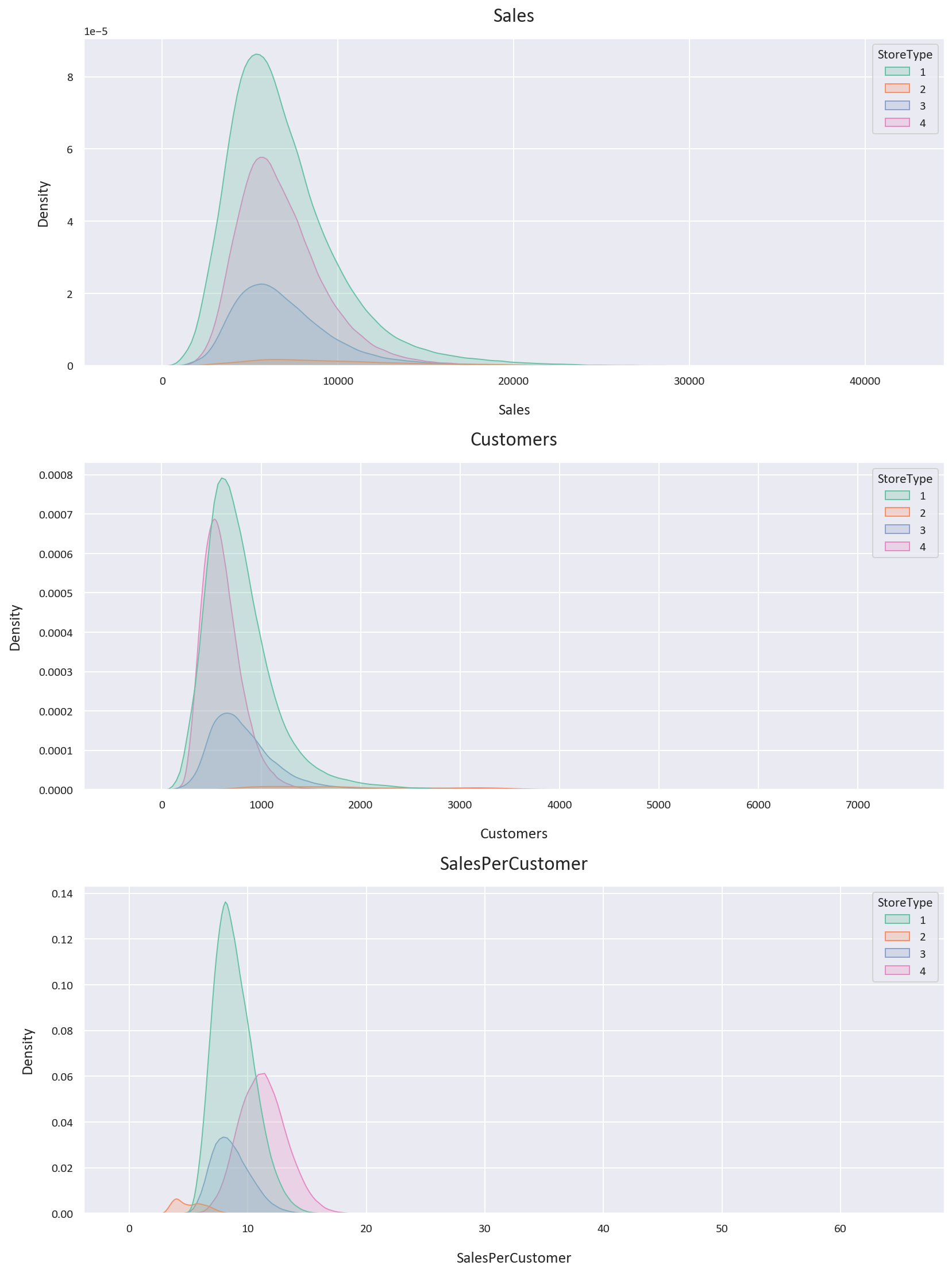
The KDE plot confirms our previous findings, with the sales and customers data being skewed to the right, while the sales per customer data is closer to the normal distribution. We also notice that the storetype 1 is the most dense of the storetypes, and that storetype 2 is the least dense of the storetypes.
How many stores are there for each storetype?
# How many stores are there for each StoreType?
df['StoreType'].value_counts()
StoreType
1 457043
4 258768
3 112968
2 15561
As we observed in the KDE plot, storetype 1 is the most common storetype, while storetype 2 is the least common storetype.
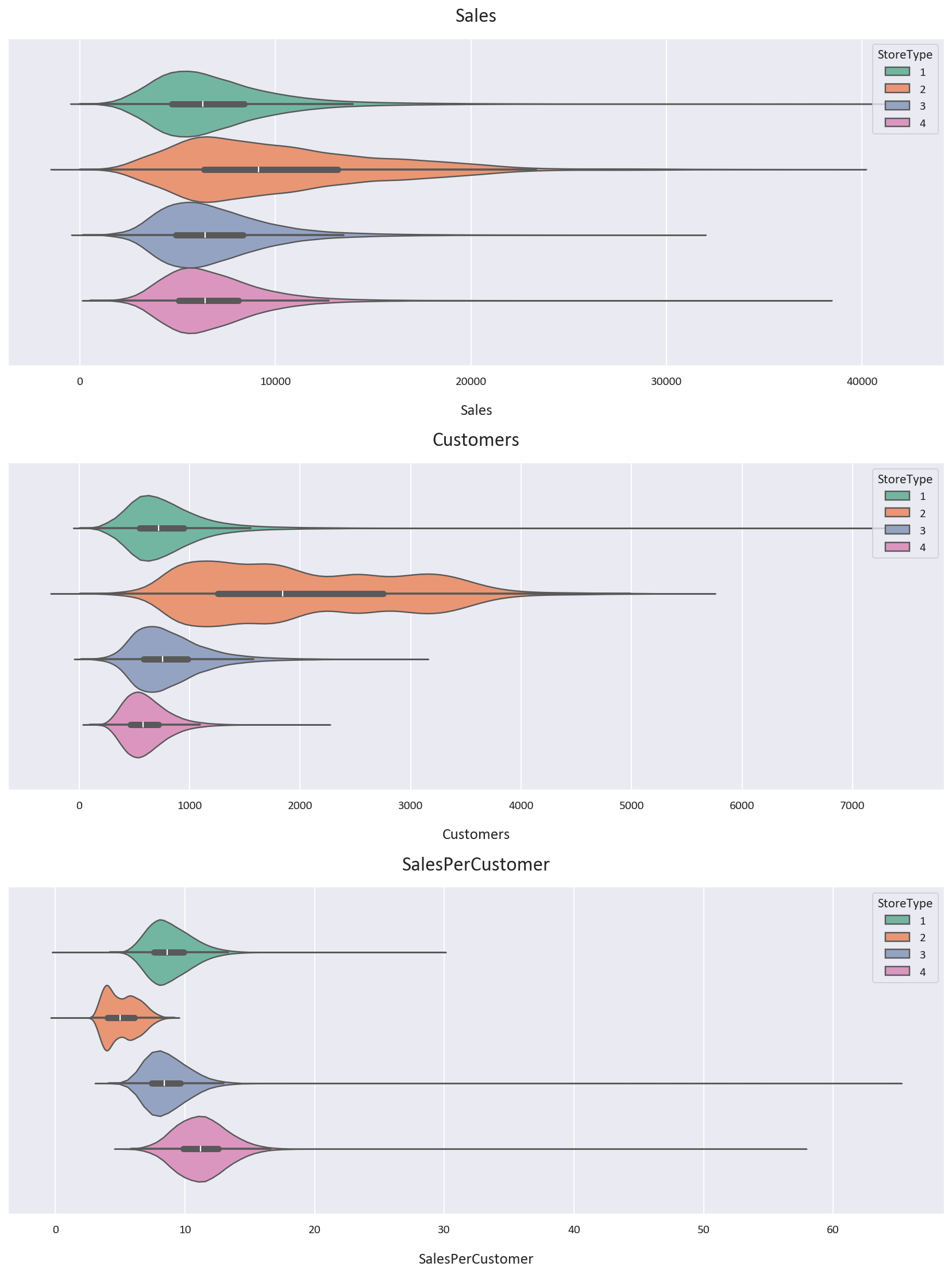
Let’s plot a Violin Plot to get a better understanding of the data.
Let’s also inspect the statistics of the data for each storetype.
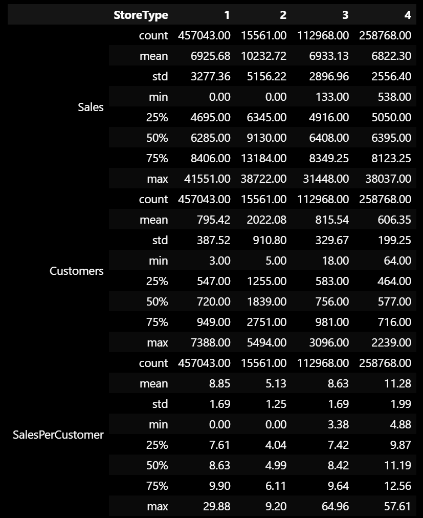
Based on the Violin Plot and the statistics, we notice some interesting points:
- Storetype 1 has more customers than storetype 4, but storetype 4 has more high-value customers, with the average customer paying 2.43 euros more than the average customer in storetype 1 and the median customer paying 2.56 euros more than the median customer in storetype 1.
- Storetype 2 has double the customers of the next highest storetype, but it has the least sales per customer, being almost half the sales per customer value of the next lowest value. It also has the highest average sales. Note that the data is scarce for storetype 2, so we should take this with a grain of salt.
- We also notice that storetype 2 is spread out the most, with the highest standard deviation for Sales and Customers, while storetype 4 is the least spread out, with the lowest standard deviation for Sales and Customers.
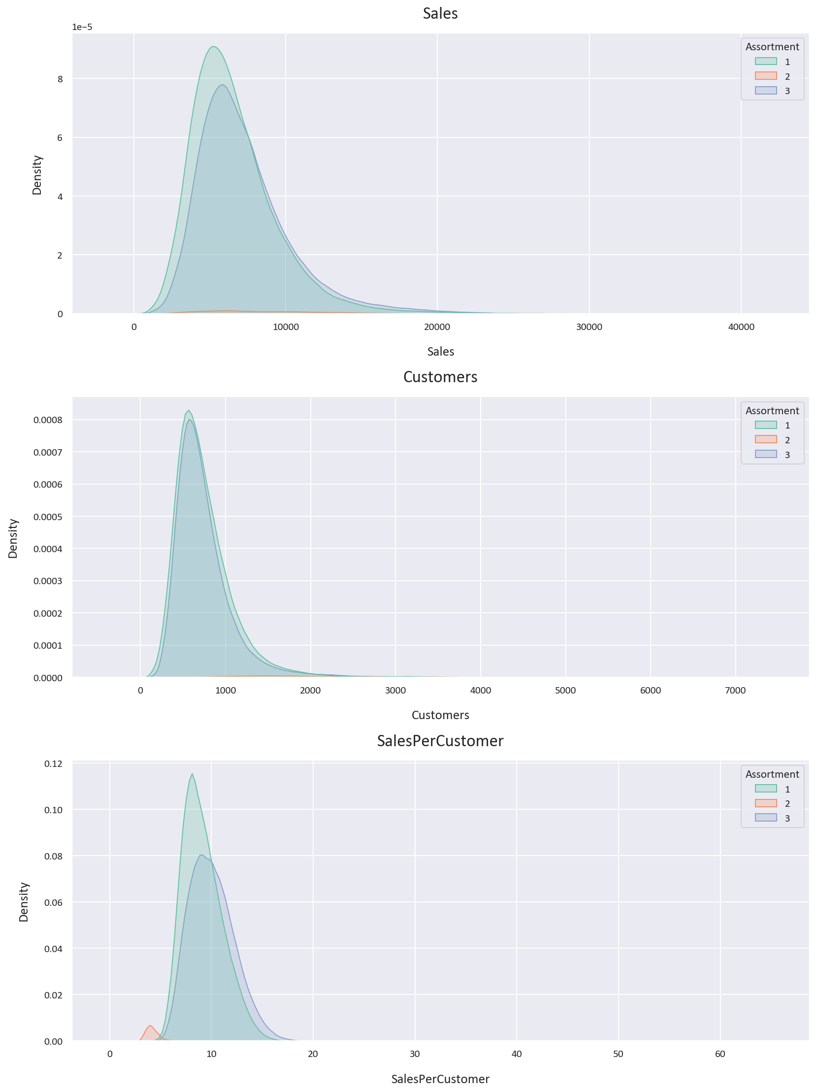
Let’s now plot the KDE plot for the Sales, Customers, and SalesPerCustomer columns for each Assortment level.
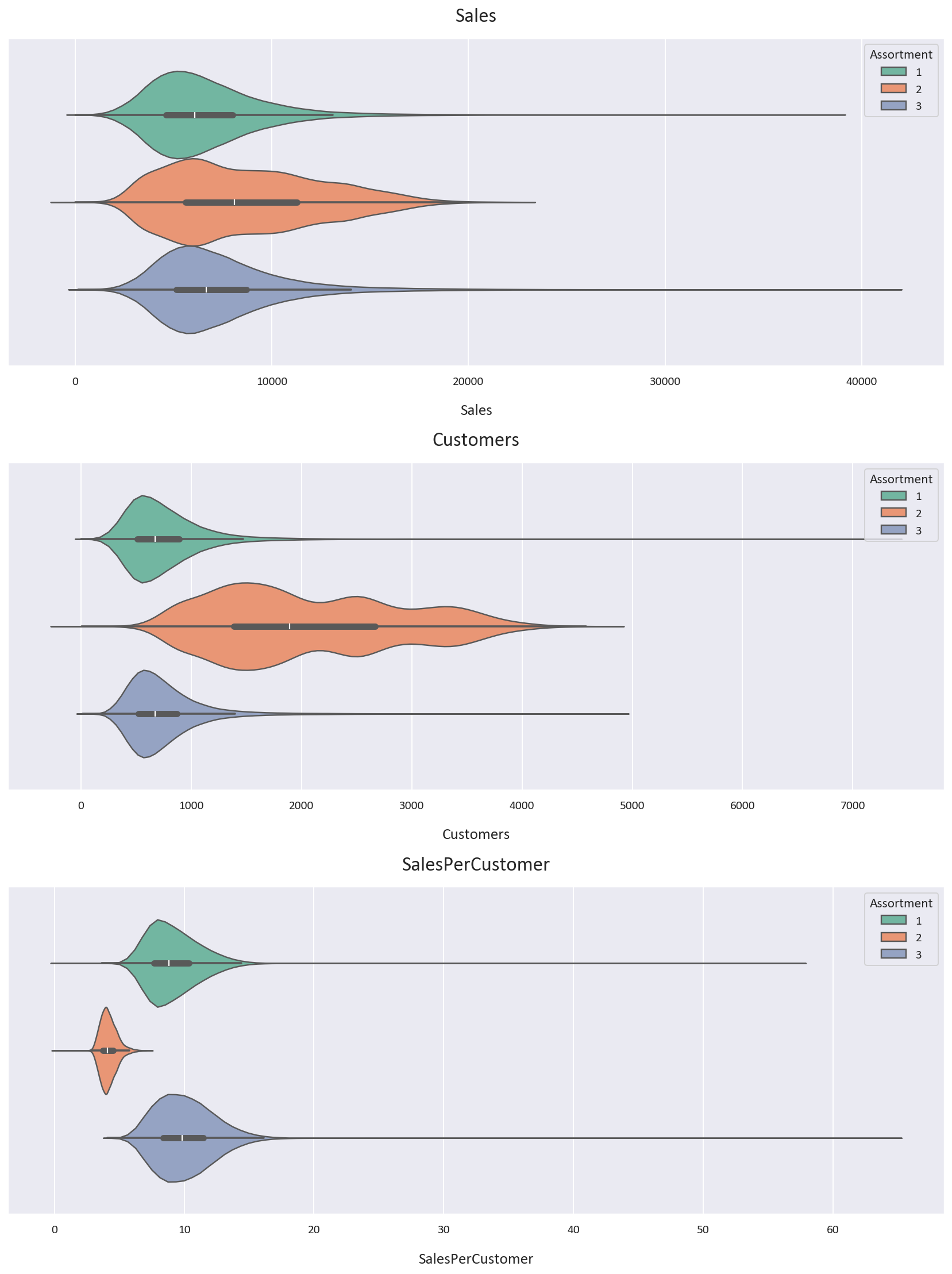
Let’s also look at the violin plots for the Sales, Customers, and SalesPerCustomer columns for each Assortment level.
Let’s also inspect the statistics of the data for each Assortment level.
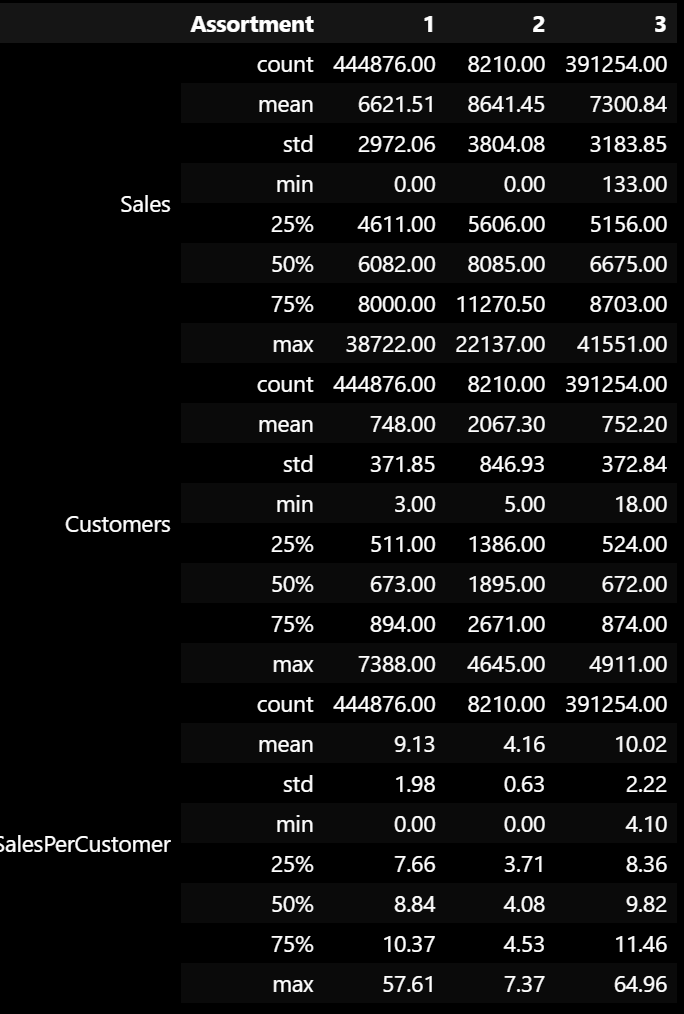
Based on the Violin Plot and the statistics, we notice some interesting points:
- Assortment type 2 has the most average and median sales and customers. It also has the least average and median sales per customer, being less than half of the other 2 assortments. This means that the customers in assortment type 2 spend less money than the customers in the other 2 assortments. It also is the most spread out, with the highest standard deviation for Sales and Customers. The data is also scarce for assortment type 2, so we should take these findings with a grain of salt as well.
- Assortment type 3 has more average and median sales, customers, and sales per customer than assortment type 1. It seems that assortment type 3 is the most profitable assortment, ignoring assortment type 2 as the data is less than 1% of the total data. This could be because assortment type 3 has the most products, so it has the most variety for the customers to choose from.
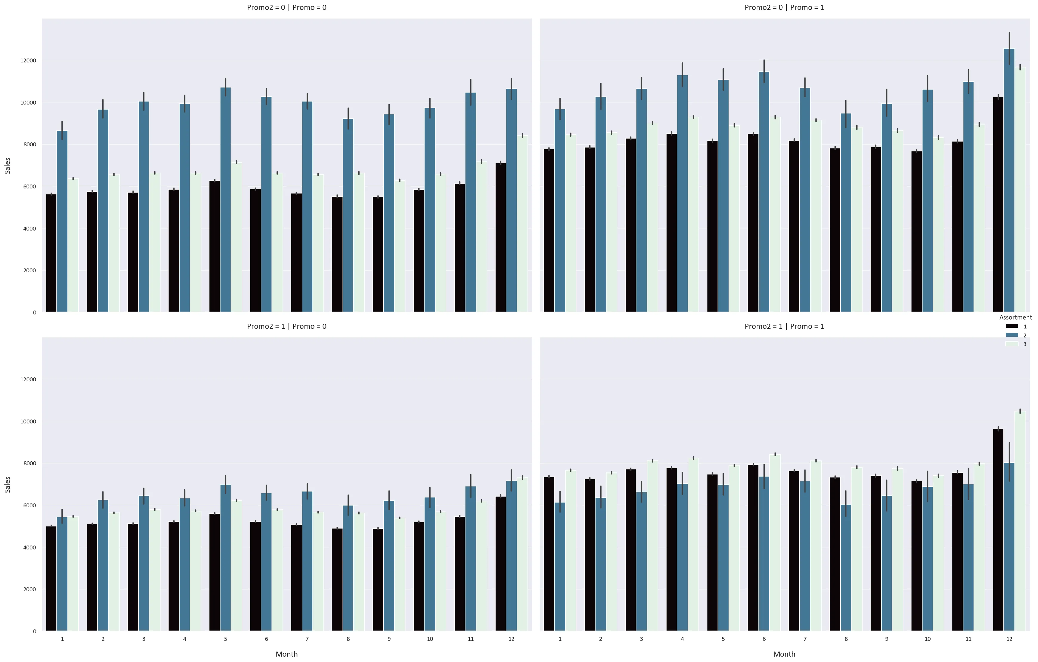
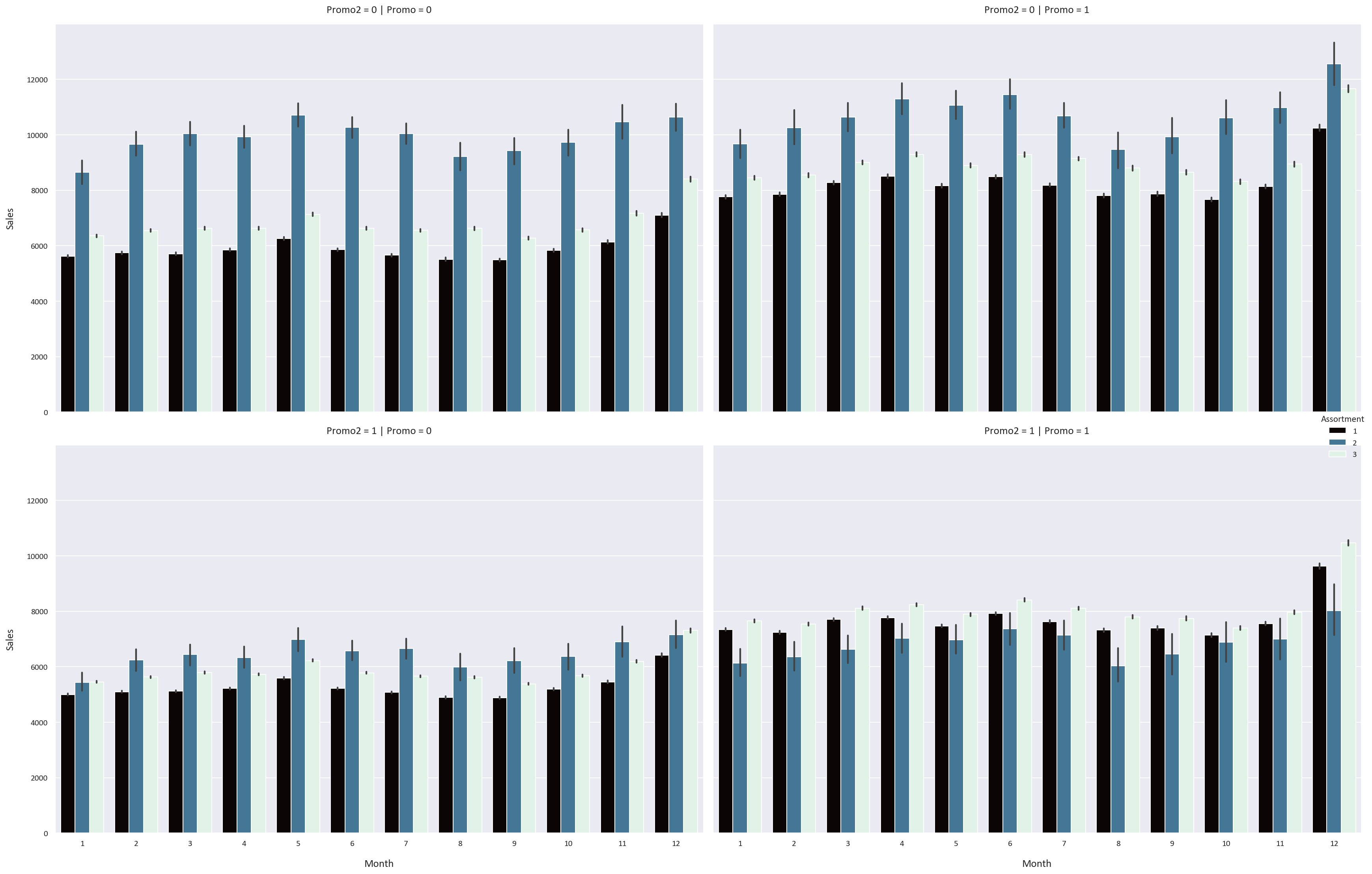
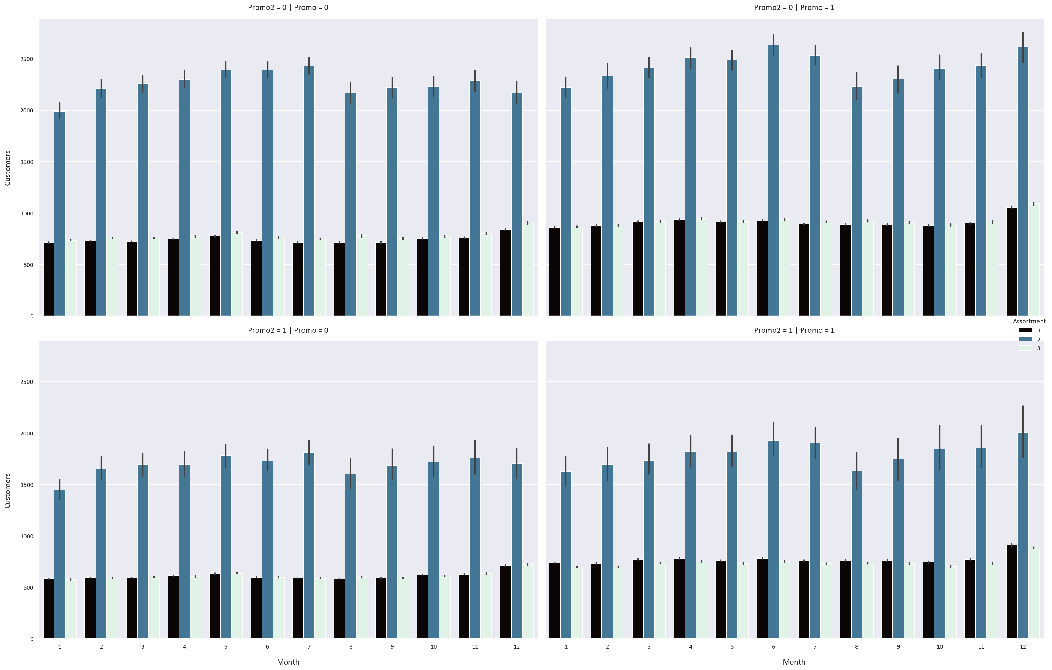
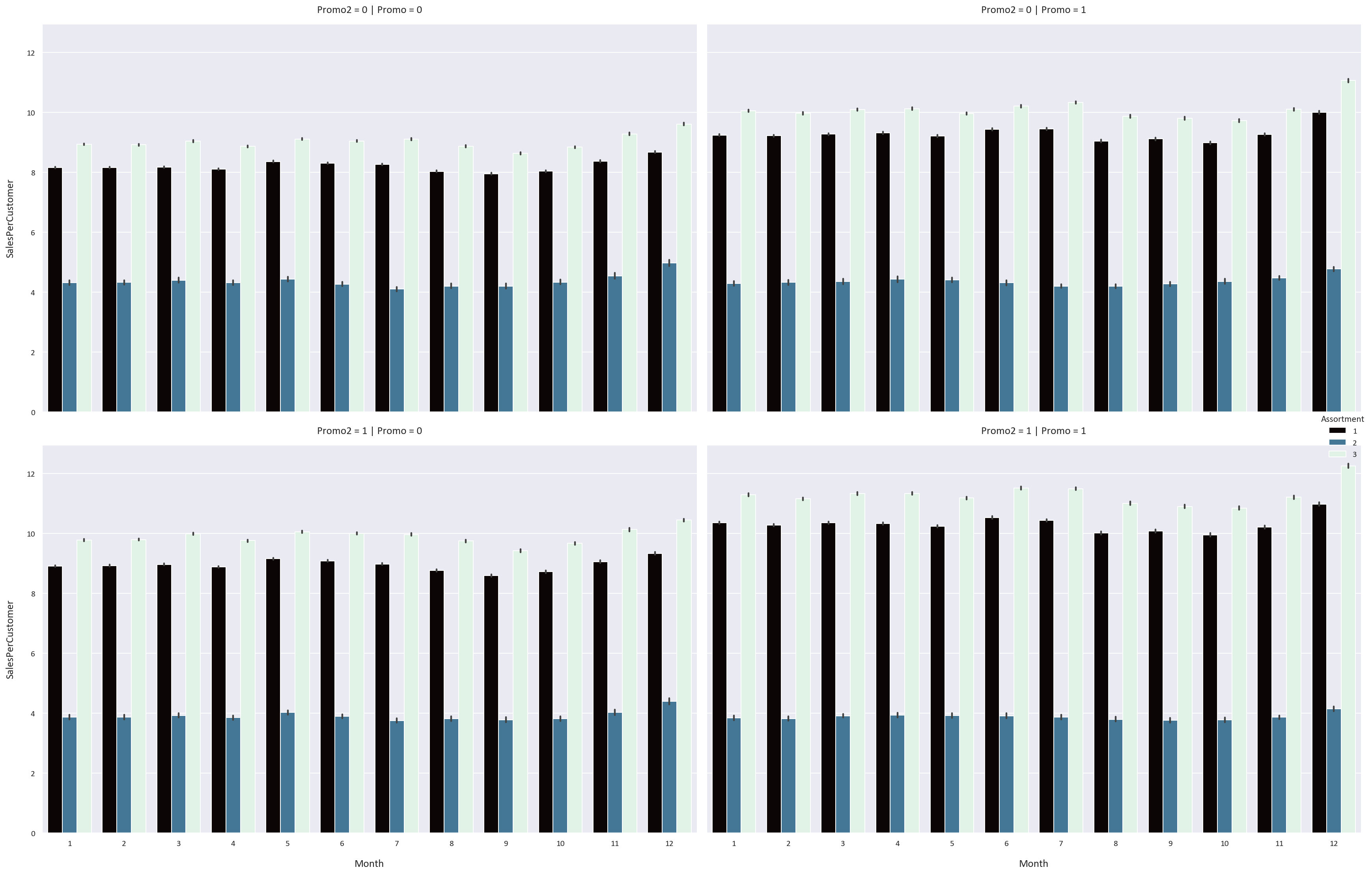
Let’s now look at how the month, promo, and promo2 features affect the sales, customers, and sales per customer for each storetype and assortment type. We use a plot called a Catplot, which is a combination of a bar plot and a violin plot for each combination of feature values.
# Plot a Catplot of the Monthly Sales based on the StoreType, Promo, and Promo2 columns
plt.figure(figsize=(16, 10))
sns.catplot(data=df, x='Month', y='Sales', hue='StoreType', kind='bar', col='Promo', row='Promo2', height=8, aspect=1.5, palette='mako')
plt.tight_layout(pad=5)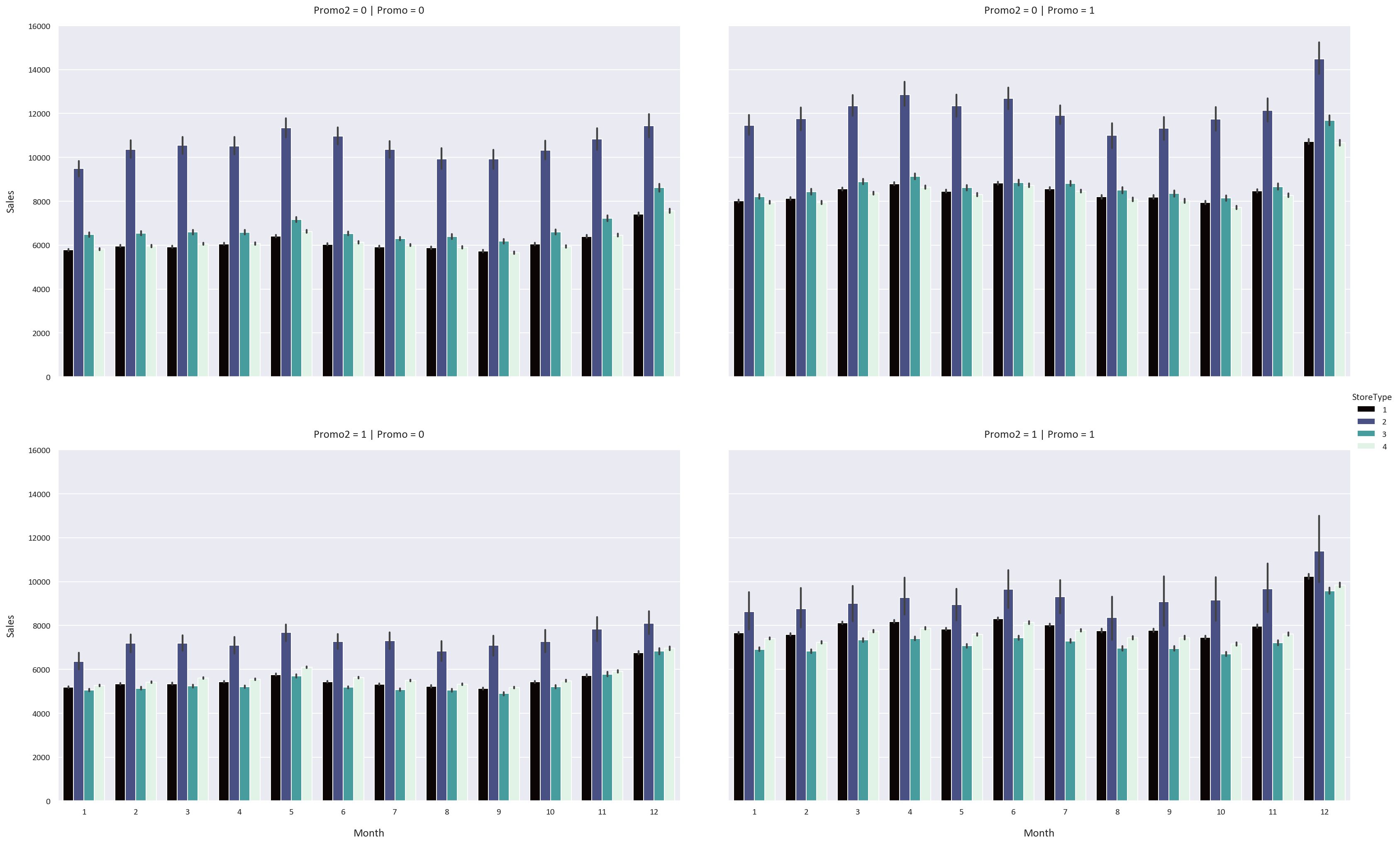
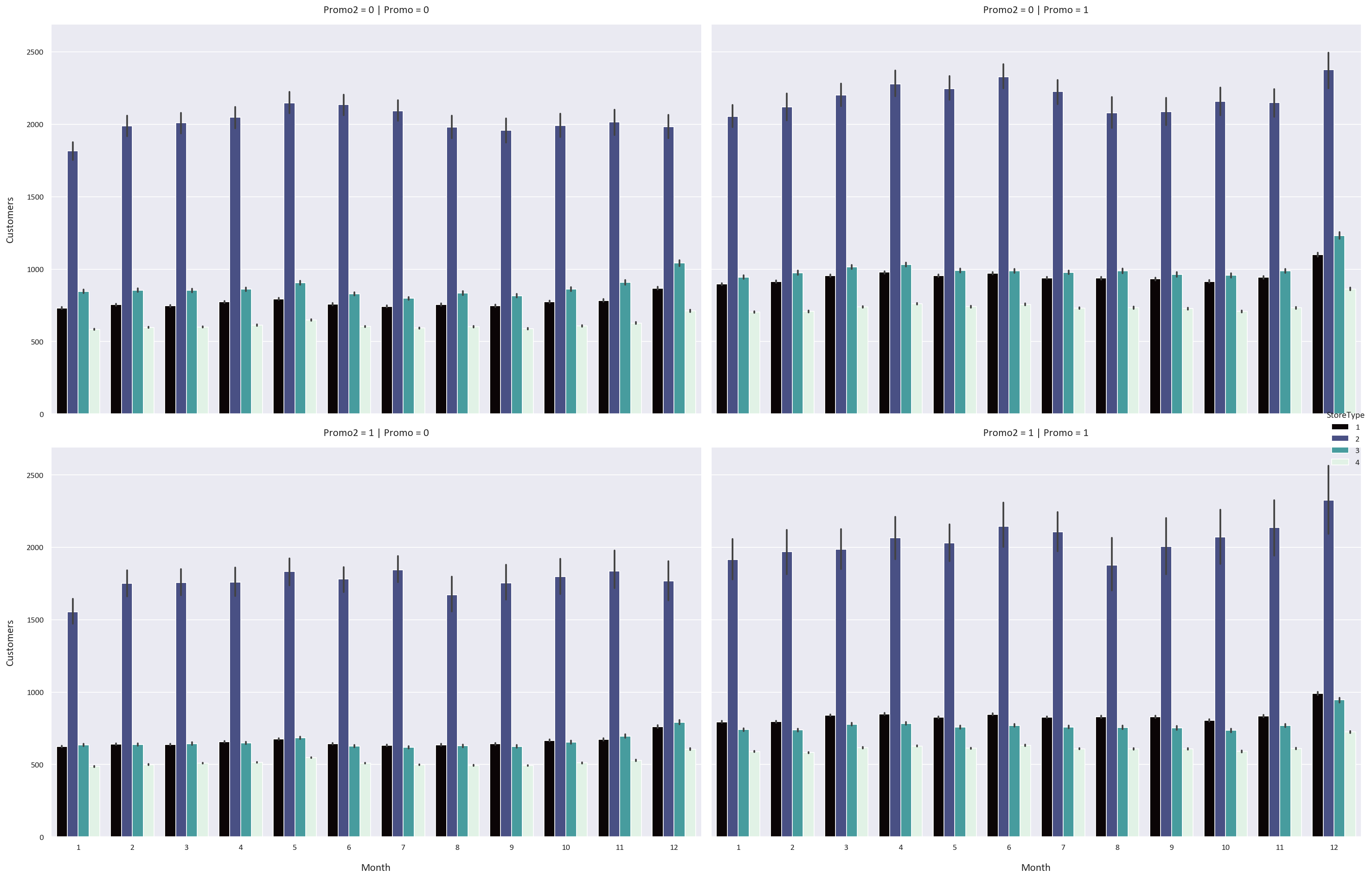
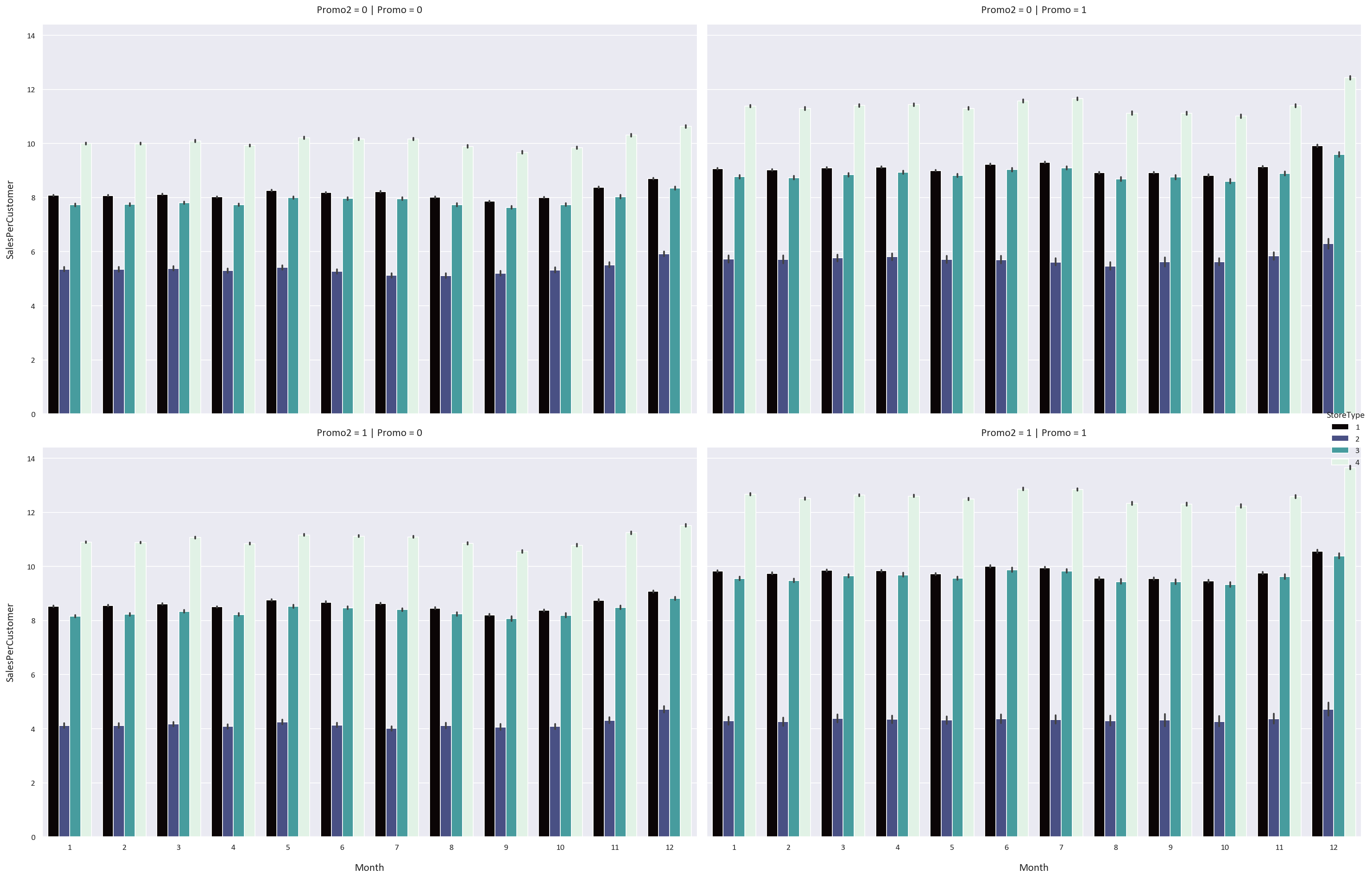
We notice some interesting patterns:
- The Promo feature increases the sales, customers, and sales per customer for all storetypes and assortment types by a significant margin. This means that the stores should have more promotions to increase their sales and customers.
- However, the Promo2 feature has an adverse effect on the sales, customers, and sales per customer for all storetypes and assortment types. We know that the Promo2 feature is a continuing and consecutive promotion, so perhaps a continuous promotion is not as effective as a one-time promotion.
- We also notice that the sales, customers, and sales per customer are highest in December and lowest in January. This could be because people buy more in December because of the sales and promotions that happen, while they buy less in January because they spent a lot of money in December.
Sales Forecasting
Let’s first resample the data to a weekly frequency to identify the trend, seasonality, noise, and autocorrelation in the data.
- Trend is when the data is increasing or decreasing over time.
- Seasonality is when the data is cyclic over a specific period.
- Noise is random fluctuations in the data.
- Autocorrelation is a little bit more complex, it is when the data is correlated with itself over time. For example, if it is rainy today, it is more likely to be rainy tomorrow. If the sales are high in a week, it is more likely to be high the next week.
# Resample the data to get the weekly sales
weekly_sales = df['Sales'].resample('W').sum()
plt.figure(figsize=(20, 8))
weekly_sales.plot()
plt.title('Weekly Sales')
plt.xlabel('Date')
plt.ylabel('Sales')
plt.tight_layout()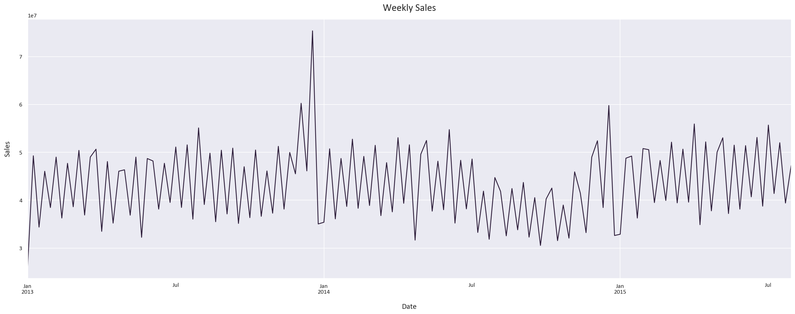
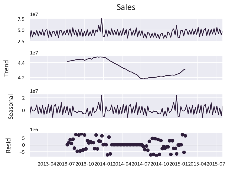
Let’s now plot the trend, seasonality, and noise in the data.
-
We notice a clear seasonality pattern, with the sales increasing in December, decreasing in January, and fluctuating throughout the rest of the year.
-
The trend isn’t as clear, as the data is over a short period of time.
What about autocorrelation?
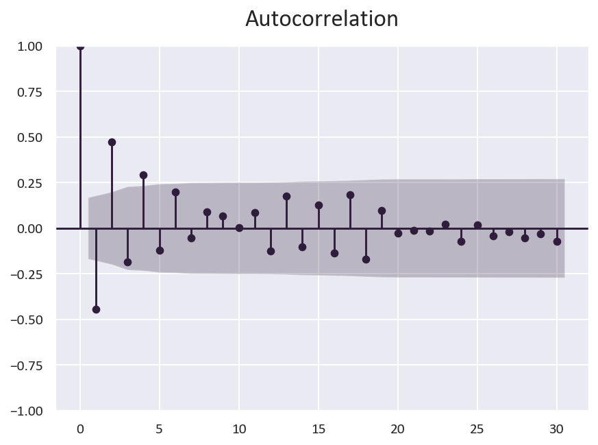
We can conclude that there is some autocorrelation in the data, but it is not very strong. You can see it when a portion of the data is above the confidence interval, like in the 0 to 5 range.
Another property of the data is the stationarity of the data. Stationarity means that the data is consistent over time. We can check this by plotting the rolling mean and standard deviation of the data.
The data being stationary is a good indicator for the models to perform better, as the data is consistent over time.
# Is the data stationary?
from statsmodels.tsa.stattools import adfuller
# Perform the Dickey-Fuller test
result = adfuller(weekly_sales)
# Print the p-value
print('p-value: ', result[1])
p-value: 0.0020208588880313446
The p-value is less than 0.05, which means that the data is stationary.
Model Building and Evaluation
Based on the trend, seasonality, noise, and autocorrelation, I think that the best model for this data is one not based on time series, but rather a regression model.
This is because there are many features that can be used to predict the sales, such as the storetype, assortment type, promo, promo2, and competition distance. If we use a time series model, we will not be able to use these features and would be relying only on the trend, seasonality, noise, and autocorrelation. As these properties are not very strong, the model will not be accurate.
We will be using a Random Forest Regressor, as it is a powerful ensemble model that can handle complex relationships between variables. It works by creating many decision trees and combining their predictions to create a more accurate prediction while reducing overfitting.
We will also try a XGBoost Regressor, which works similarly to the Random Forest Regressor, but it iteratively constructs decision trees, where each new tree is built to reduce the errors of the previous tree. This model is very powerful and can achieve state-of-the-art results on a variety of difficult machine learning tasks.
As for the evaluation methods we will use four metrics:
- Mean Absolute Error (MAE): the mean of the absolute value of the errors. This is the easiest metric to understand, as it is simply the average error.
- Mean Absolute Percentage Error (MAPE): the mean of the absolute value of the percentage errors, or the absolute percentage difference between the actual and predicted values. This is a good metric to use when we want to minimize the effect of outliers. However, it is not very useful when the actual values are close to zero, as the percentage error will be very high. It can be from 0% to infinity, with 0% being a perfect prediction.
This is its formula:
MAPE = (1/n) * ∑(|Predicted - Actual| / |Actual|) * 100%
- Symmetric Mean Absolute Percentage Error (SMAPE): SMAPE is calculated as the mean of the absolute value of the percentage errors, but the absolute difference is divided by the sum of the mean of the absolute values of the actual and predicted values. This is a better metric to use for outlier-heavy data as it is symmetric, meaning that it doesn’t matter if the actual value is larger or the predicted value is larger. It can be from 0% to 200%, with 0% being a perfect prediction and 200% being the worst prediction possible.
This is its formula:
SMAPE = (1/n) * ∑(|Predicted - Actual| / (|Actual| + |Predicted|)/2) * 100%
- R2 Score: the proportion of the variance in the dependent variable that is predictable from the independent variable(s). It is useful for determining how well the model explains the variance in the data. It can be from 0 to 1, with 1 meaning the model explains all the variance in the data and 0 meaning the model explains none of the variance in the data. Of course, having an R2 score close to 1 is not always a good thing, as it could mean that the model is overfitting. For human behavior related studies, the R2 score is usually less than 0.5, as human behavior is harder to predict than physical behavior. Reference
Data Preparation
First, let’s prepare our features and target variables:
# Define features and target while dropping non-predictive columns
X = df.drop(['Sales', 'Store', 'Customers', 'SalesPerCustomer'], axis=1)
y = df['Sales']

# Split into training and testing sets
X_train, X_test, y_train, y_test = train_test_split(X, y, test_size=0.2, random_state=0)
Random Forest Model
We’ll start with a Random Forest model using carefully chosen hyperparameters:
# Initialize Random Forest with optimal parameters
rf = RandomForestRegressor(
  n_estimators=300,     # Number of trees
  random_state=0,       # For reproducibility
  n_jobs=-1,           # Use all available cores
  verbose=1,           # Show training progress
  max_depth=30         # Prevent overfitting
)

# Train the model
rf.fit(X_train, y_train)

# Make predictions
y_pred = rf.predict(X_test)

# Evaluate performance
mae = mean_absolute_error(y_test, y_pred)
mape = np.mean(np.abs((y_test - y_pred) / y_test)) * 100
smape = np.mean(2 * np.abs(y_pred - y_test) / (np.abs(y_test) + np.abs(y_pred))) * 100
r2 = r2_score(y_test, y_pred)

print('Random Forest Metrics:')
print(f'Mean Absolute Error: {mae:.2f}')
print(f'Mean Absolute Percentage Error: {mape:.2f}%')
print(f'Symmetric Mean Absolute Percentage Error: {smape:.2f}%')
print(f'R2 Score: {r2:.2f}')
Random Forest Metrics:
Mean Absolute Error: 1115.2309882185264
Mean Absolute Percentage Error: 17.401195204365806
Symmetric Mean Absolute Percentage Error: 16.12417120245528
R2 Score: 0.704369772527475
XGBoost Model
Next, let’s implement an XGBoost model with optimized parameters:
import xgboost as xgb

# Initialize XGBoost with optimal parameters
xgb_reg = xgb.XGBRegressor(
  n_estimators=300,                # Number of boosting rounds
  random_state=0,                  # For reproducibility
  objective='reg:absoluteerror',   # Optimize for MAE
  max_depth=10                     # Control model complexity
)

# Train the model
xgb_reg.fit(X_train, y_train)

# Make predictions
y_pred_xgb = xgb_reg.predict(X_test)

# Evaluate performance
mae_xgb = mean_absolute_error(y_test, y_pred_xgb)
mape_xgb = np.mean(np.abs((y_test - y_pred_xgb) / y_test)) * 100
smape_xgb = np.mean(2 * np.abs(y_pred_xgb - y_test) / (np.abs(y_test) + np.abs(y_pred_xgb))) * 100
r2_xgb = r2_score(y_test, y_pred_xgb)

print('XGBoost Metrics:')
print(f'Mean Absolute Error: {mae_xgb:.2f}')
print(f'Mean Absolute Percentage Error: {mape_xgb:.2f}%')
print(f'Symmetric Mean Absolute Percentage Error: {smape_xgb:.2f}%')
print(f'R2 Score: {r2_xgb:.2f}')
XGBoost Metrics:
Mean Absolute Error: 1031.599894705175
Mean Absolute Percentage Error: 16.021434332031838
Symmetric Mean Absolute Percentage Error: 15.124611440443609
R2 Score: 0.7304052654222772
Feature Importance Analysis
Understanding which features are the most important for the model is a good way to understand how the model is making predictions.
# Plot feature importances for both models
plt.figure(figsize=(20, 8))
plt.subplot(1, 2, 1)
sns.barplot(x=rf.feature_importances_, y=X.columns)
plt.title('Random Forest Feature Importances')
plt.subplot(1, 2, 2)
sns.barplot(x=xgb_reg.feature_importances_, y=X.columns)
plt.title('XGBoost Feature Importances')
plt.tight_layout()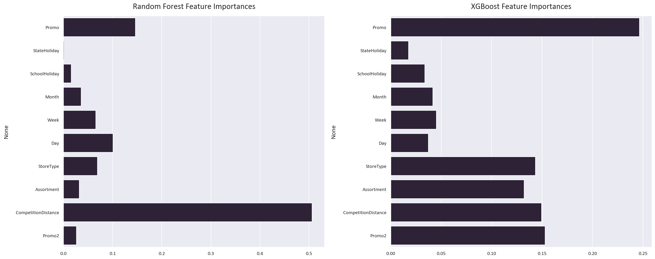
Model Comparison
Let’s visualize how well our models predict actual sales:
plt.figure(figsize=(20, 8))
plt.subplot(1, 2, 1)
sns.scatterplot(x=y_test, y=y_pred)
plt.xlabel('Actual Values')
plt.ylabel('Predicted Values')
plt.title('Random Forest: Actual vs Predicted')

plt.subplot(1, 2, 2)
sns.scatterplot(x=y_test, y=y_pred_xgb)
plt.xlabel('Actual Values')
plt.ylabel('Predicted Values')
plt.title('XGBoost: Actual vs Predicted')
plt.tight_layout()

# Plot prediction differences
plt.figure(figsize=(20, 8))
plt.subplot(1, 2, 1)
sns.lineplot(x=y_test.index, y=y_test - y_pred, ci=None)
plt.xlabel('Date')
plt.ylabel('Sales Difference')
plt.title('Random Forest: Prediction Error Over Time')

plt.subplot(1, 2, 2)
sns.lineplot(x=y_test.index, y=y_test - y_pred_xgb, ci=None)
plt.xlabel('Date')
plt.ylabel('Sales Difference')
plt.title('XGBoost: Prediction Error Over Time')
plt.tight_layout()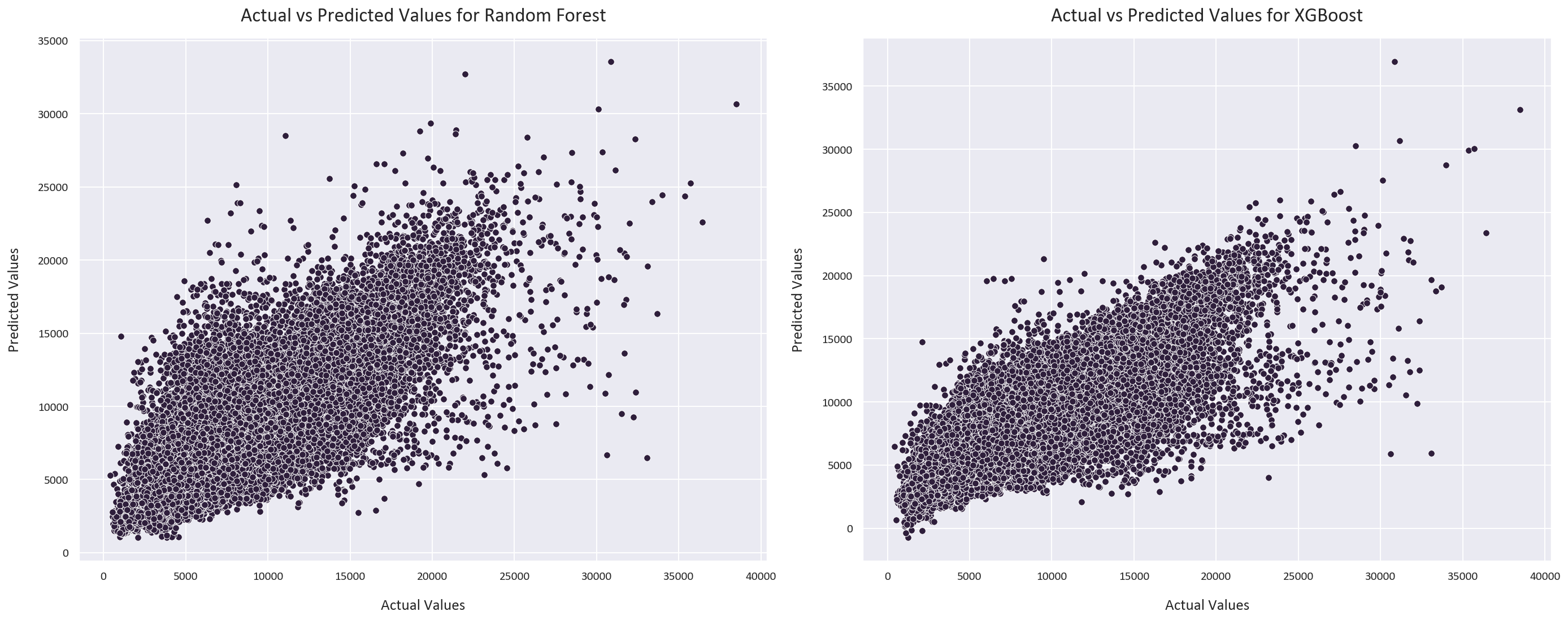
The random forest regressor’s predictions are more spread out, while the XGBoost regressor’s predictions are more concentrated around the line of best fit.
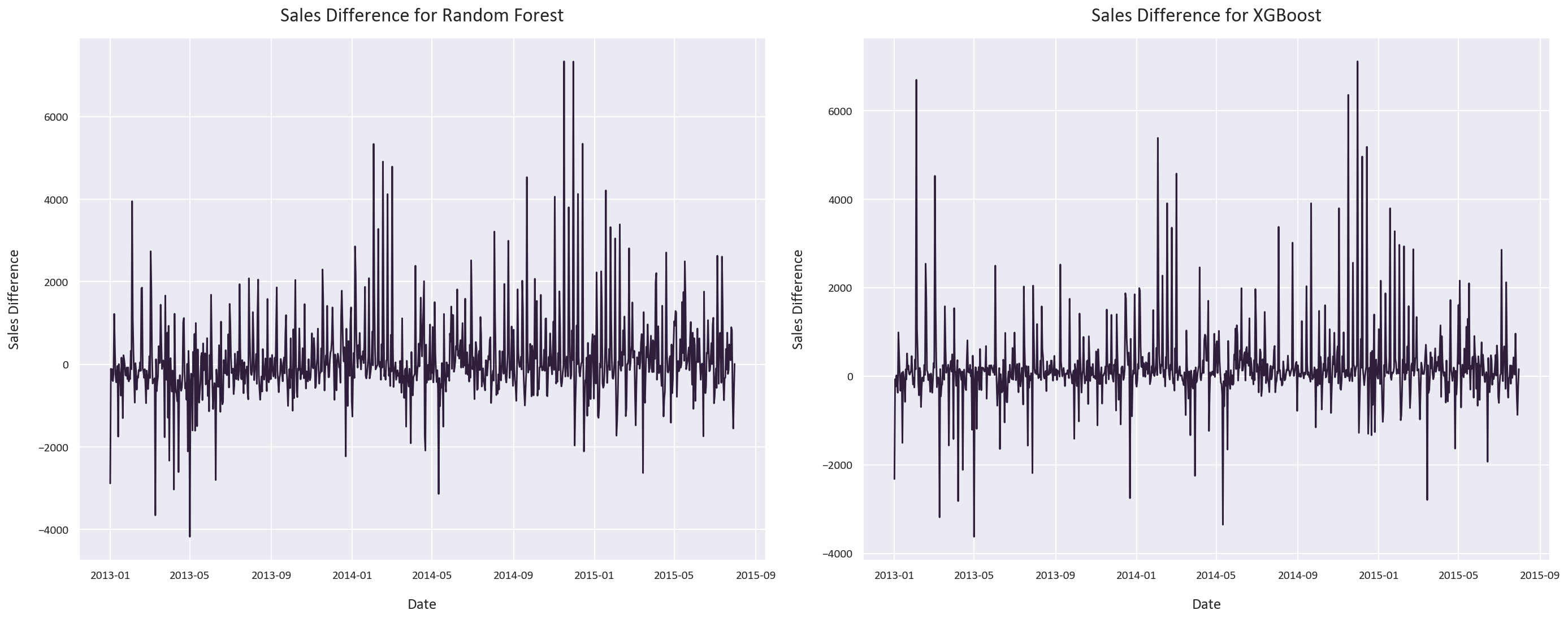
The random forest regressor’s prediction error is more general, while the XGBoost regressor’s prediction error has spikes instead of regions of high error.
Model Performance Summary
Both models performed exceptionally well:
Random Forest:
- MAE: 1,115 euros
- SMAPE: 16.12%
- R² Score: 0.70
XGBoost:
- MAE: 1,031 euros
- SMAPE: 15.12%
- R² Score: 0.73
The XGBoost model slightly outperformed Random Forest, likely due to its ability to:
- Learn from its mistakes through boosting
- Handle non-linear relationships more effectively
- Capture complex feature interactions
- It learnt that the promo and promo2 features are important, while the random forest model did not.
The high R² scores (0.70-0.73) indicate strong predictive power, especially considering the complexity of sales forecasting where many external factors can influence outcomes.
Testing the models
Let’s test the models on the test set:
# Plot both predictions with 95% confidence intervals
plt.figure(figsize=(20, 8))
sns.lineplot(x=test.index, y=test_pred, label='Random Forest', ci=95)
sns.lineplot(x=test.index, y=test_pred_xgb, label='XGBoost', ci=95)
plt.xlabel('Date')
plt.ylabel('Sales')
plt.legend()
plt.tight_layout()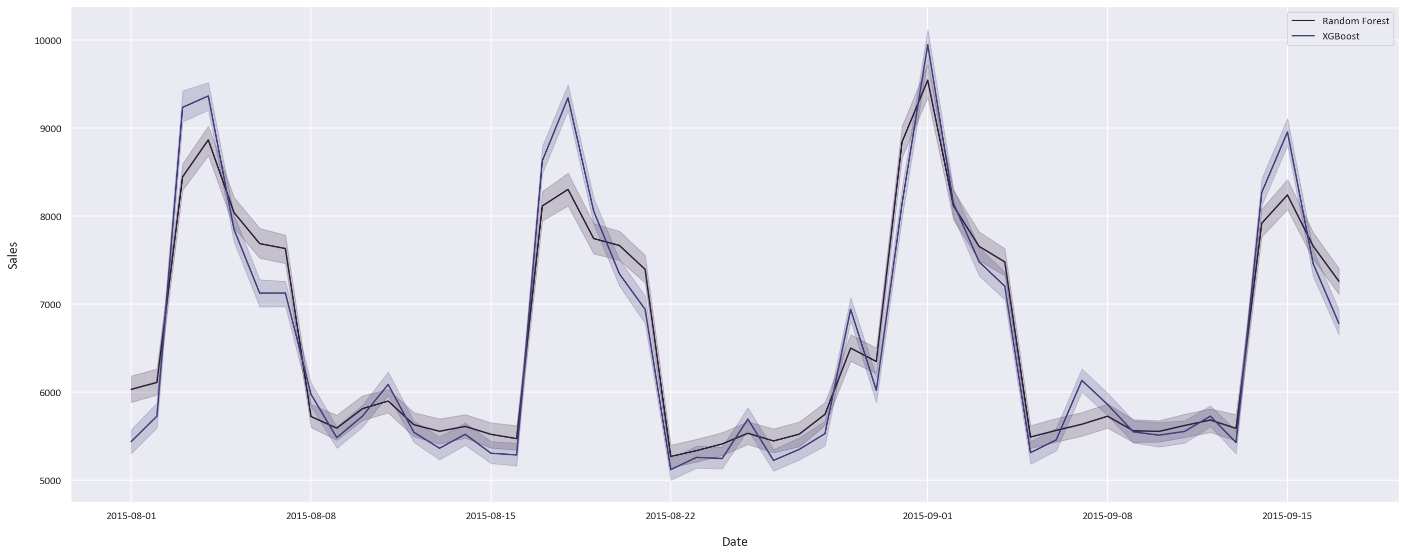
The two models’ predictions are fairly close, this was expected as they performed similarly on the training data. The results are very promising, and the models are able to predict the sales very well.
Conclusion
Our sales forecasting project successfully demonstrated the power of ensemble methods in predicting retail sales. Key achievements include:
-
Data Preprocessing
- Handled missing values appropriately for different feature types
- Engineered temporal features from date information
- Cleaned and standardized categorical variables
-
Feature Engineering
- Created meaningful derived features like SalesPerCustomer
- Identified and removed redundant competition metrics
- Preserved important features based on correlation analysis
-
Model Performance
- Achieved R² scores above 0.70 with both models
- XGBoost slightly outperformed Random Forest
- Mean Absolute Errors around 1,000 euros
-
Business Insights
- Identified key sales drivers through feature importance
- Discovered counterintuitive competition-sales relationships
- Quantified promotion effectiveness
The techniques demonstrated here can be applied to various forecasting problems beyond retail sales, such as:
- Inventory optimization
- Resource allocation
- Demand prediction
- Revenue forecasting
You can find the code for this project here .